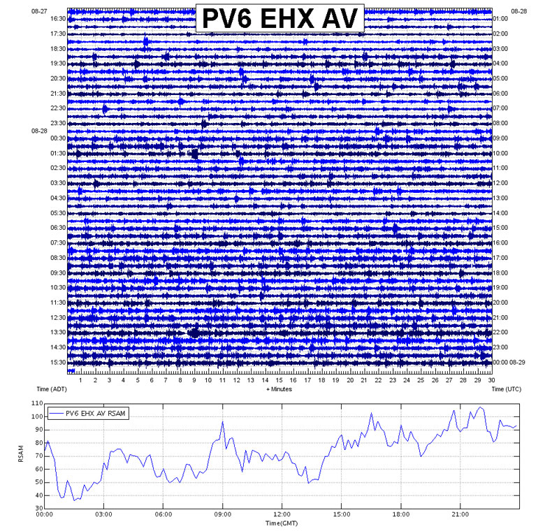
The figure on the top is of a 24-hour webicorder and the bottom is of the RSAM plot for the same seismic station for the same time period. Note how the slight increases and decreases in seismic activity that can be noted visually in the webicorder can been more clearly and quantified in the time-series RSAM plot. Slight decreases in activity can be seen in the webicorder at approximately 1330 UTC (the time noted on the right side of the webicorder), 0200, and 0630. Also the overall trend of increasing activity is more easily seen in the RSAM plot.
Date: 2000
Volcano(es): Pavlof
Photographer: Alaska Volcano Observatory
URL: avo.alaska.edu/image/view/195238
Credit: Image courtesy of AVO/USGS.
Use Restriction: Please cite the photographer and the Alaska Volcano Observatory / U.S. Geological Survey when using this image.
Full Resolution.
Volcano(es): Pavlof
Photographer: Alaska Volcano Observatory
URL: avo.alaska.edu/image/view/195238
Credit: Image courtesy of AVO/USGS.
Use Restriction: Please cite the photographer and the Alaska Volcano Observatory / U.S. Geological Survey when using this image.
Full Resolution.
×
![Instrument data]()